 |
| Design by Shannon Kilford of Born to Party, Mosman, NSW, Australia. www.borntoparty.com.au |
 The Pantone® Colour of the Year 2017 is "Greenery." It is described by Pantone as "A refreshing and revitalising shade, Greenery is symbolic of new beginnings. Greenery is a fresh and zesty yellow-green shade that evokes the first days of spring when nature's greens revive, restore and renew."
 |
| Photo courtesy of www.Greenweddingshoes.com Spring Garden inspired Vibiana Wedding. photography: Luke and Katherine Griffin from Max and Friends // venue: The Vibiana Los Angeles, California // event design: Lace & Likes |
Checking out the latest colour trends is always exciting. I love to see what we can expect to see happening in the balloon industry over future months! Greenery is not just a colour, it is also a term for green foliage that can work incredibly well with balloons! I love the simplicity of the 3' White balloons with a foliage garland attached to each of the balloons! You could work with real foliage, or if you have a good floral wholesaler, you could use artificial greenery garlands as a great alternative. These are the Qualatex® balloon colours that I believe will work really well with this trend: Spring Green, Lime Green, Green, and of course, the Green Rainbow SuperAgate®.
Here are some more fabulous decor ideas that incorporate balloons with foliage and flowers. I love this trend!
 |
| Photo courtesy of www.greenweddingshoes.com Surprise Party by Casa de Perrin. photography: Paige Jones Photo // florals: Moon Canyon Design // balloons: Geronimo Balloons |
I love this beautiful table setting by QBN member Shannon Kilford of Born to Party in Mosman, NSW, Australia. Shannon worked in collaboration with a florist to create this truly unique and elegant table that was featured in HORRAY Magazine!
 |
| Design by Shannon Kilford of Born to Party, Mosman, NSW, Australia. www.borntoparty.com.au |
 |
| Design by Shannon Kilford of Born to Party, Mosman, NSW, Australia. www.borntoparty.com.au Pantone's Top 10 Colors for Spring 2017 |
In addition to Greenery, Pantone has predicted other colours that will be "hot" this spring.

This is how Pantone describes the collection - "A Mixture of Vitality, Relaxation and the Great Outdoors. From colors that are bright and vivid to those that convey a sense of earthiness, our top 10 colors for spring 2017 are reminiscent of the hues that surround us in nature."
So these are the colours that we can expect some of our customers to be requesting us to use for their decor! Let's see how we can work with some of them in the decor that we make.
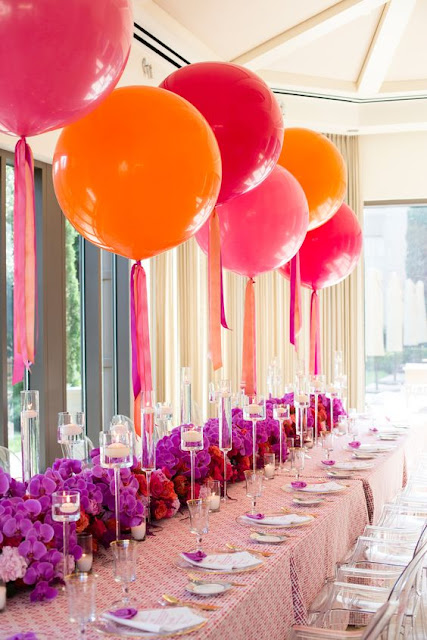
I believe that Orange, Wild Berry, Pearl Mandarin Orange and Pearl Magenta really suit this fabulous colour combination. I also think that we could use Goldenrod and Rose when combining these colours together to create different tones.
 |
| Fabulous 3' Orange and Pink balloon decor with ribbons and floral table arrangements. I would love to credit the designer. Please let me know if you created this fabulous table setting! |
Qualatex Caribbean Blue is the perfect balloon choice to match this beautiful shade of Blue.
 |
| Balloon Decor by Balloon Artistry, Chestnut Ridge, NY, U.S.A www.balloonartistry.com |
Colour is a very big part of what we do every day! Being aware of colour trends and fashions is extremely important! Watch out for a follow-up post coming soon with the fabulous Shannon Kilford of Born to Party. Shannon will share with us one of her newest installations, using foliage, Bubbles, and White balloons with Gold accent confetti balloons! Excited, I know I am!
Happy Ballooning!
Sue


Comments